WPF attempts to bring the best of rich-client technologies like Windows Forms, and layout techniques from the browser to give a high degree of flexibility when positioning elements on forms.
Rich client technologies like VB6 forms, Access Forms etc were based on absolute positioning. As a developer you specified the top and left values for a control to position it on the form. This allows for a fine degree of control, but often required a large amout of code to handle form re-sizing. This was an imperative approach to layout. Controls like Labels and Panels had no awareness of the size of the content inside them - for example if the content of a label was larger than what could be displayed in the label then the content is clipped, and not shown.
Web UI rendered in the browser typically require no re-sizing code. Instead HTML gives a declarative approach to the layout of elements. You specify a serise of containers like <div> elements (or <table>, <tr> and <td> elements if you haven't become convinced of the benefits of positional CSS-based layouts) and position those by either floating them Left or Right, or positioning them absolutely in your page. Elements like <div> are aware of the size of their contents and will stretch to accomodate their content.
Both these approaches could be equally difficult to achieve the desired layout, although the declarative approach had the advantage of requiring much less code to do so. Recently windows forms has added concepts like Docking and Anchoring, adding a more declarative approach to rich-client development. WPF continues this trend with a declarative approach to layout based on the concept of panels.
Most UI elements in WPF can only contain a single child element - for example the following Xaml code fails to compile with the following error: "The 'Button' object already has a child and cannot add 'CheckBox'. 'Button' can accept only one child."
Xaml Syntax (does not compile)
<Button>
<TextBlock>Some Text...</TextBlock>
<CheckBox />
<ComboBox />
</Button>
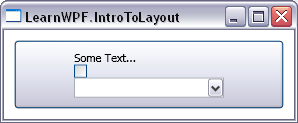
If the button allowed these two elements to be nested inside it it would be responsible for laying them out somehow. Since there are many possible ways these items could be layed out the button would have to become a much more complicated control to accomodate them all, and would now have two "responsibilities" - allowing the user to click on it, and laying out content. Not only would the button become much more complicated but all the controls in WPF would become more complicated. Instead of taking this approach the WPF team decided to factor out the responsibility for layout to a different control - the panels. There are a number of different types of panels in WPF and each enables a different kind of layout. Panels can be nested wherever regular content can be placed, allowing a fine degree of control over the layout of items. For example to correct the problem in the example above we could nest a StackPanel inside the button, and position the elements inside the StackPanel
<Button>
<StackPanel>
<TextBlock>Some Text...</TextBlock>
<CheckBox />
<ComboBox />
</StackPanel>
</Button>
This give the following layout:
Having briefly introduced the important role panels play in controlling layout in WPF let's look at the most commonly used panel types and their characteristics.
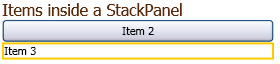
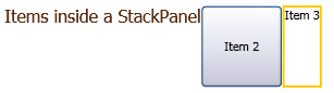
StackPanel
The StackPanel lays out child elements by stacking them one after the other. Elements are "stacked" in the order they appear in the Xaml file (document order in XML terms). Items can either be stacked vertically (the default) or horizontally.
Xaml Syntax for Stacking Vertically (Feb 2006 CTP):
<StackPanel>
<TextBlock FontSize="16"
Foreground="#58290A">
Items inside a StackPanel</TextBlock>
<Button>Item 2</Button>
<Border BorderBrush="#feca00" BorderThickness="2">
<TextBlock>Item 3</TextBlock>
</Border>
</StackPanel>
Xaml Syntax for Stacking Horizontally (Feb 2006 CTP):
<StackPanel Orientation="Horizontal">
<TextBlock FontSize="16"
Foreground="#58290A">
Items inside a StackPanel</TextBlock>
<Button>Item 2</Button>
<Border BorderBrush="#feca00" BorderThickness="2">
<TextBlock>Item 3</TextBlock>
</Border>
</StackPanel>
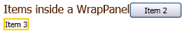
WrapPanel
The wrap panel lays out items from left to right. When a row of items has filled the horizontal space available to them the panel wraps the next item around onto the next line (in a similar way to how text is layed out).
Xaml Syntax (Feb 2006 CTP):
<WrapPanel>
<TextBlock FontSize="16"
Foreground="#58290A">
Items inside a WrapPanel</TextBlock>
<Button>Item 2</Button>
<Border BorderBrush="#feca00" BorderThickness="2">
<TextBlock>Item 3</TextBlock>
</Border>
</WrapPanel>
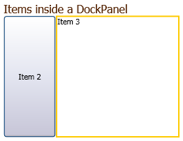
DockPanel
The DockPanel allows elements to be docked to the edges of the panel's container, similar to Windows Forms docking. Items are docked in the order they appear in the Xaml file (document order). The last Border element fills all the remaining space since no DockPanel.Dock attribute is specified for it.
Xaml Syntax (Feb 2006 CTP):
<DockPanel>
<TextBlock FontSize="16" DockPanel.Dock="Top"
Foreground="#58290A">
Items inside a DockPanel</TextBlock>
<Button DockPanel.Dock="Left">Item 2</Button>
<Border BorderBrush="#feca00" BorderThickness="2">
<TextBlock>Item 3</TextBlock>
</Border>
</DockPanel>
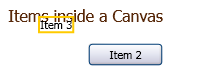
Canvas
The Canvas panel is similar to the way old rich-client layout worked where you control the absolute position of things by setting a Top and Left property for them. Additionally, instead of setting the Left to position an item you can instead set the Right, or instead of setting the Top you can set the Bottom. If you specify a Left and a Right the Right value is ignored, the element does not change its size to make both these values correct, and similarly Top takes precedence over Bottom. Elements that are declared earlier in the Xaml file can appear behind elements that are declared later (if their positions over-lap).
Xaml Syntax (Feb 2006 CTP):
<Canvas>
<TextBlock FontSize="16" Canvas.Top="10" Canvas.Left="20"
Foreground="#58290A">
Items inside a Canvas</TextBlock>
<Button Canvas.Bottom="25" Canvas.Right="50">Item 2</Button>
<Border BorderBrush="#feca00" BorderThickness="2"
Canvas.Top="20" Canvas.Left="50">
<TextBlock>Item 3</TextBlock>
</Border>
</Canvas>
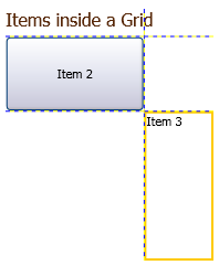
Grid
The Grid panel is an extremely flexible panel, and can be used to achieve almost everything that can be done with the other panel controls (although often not with the same ease). The grid panel allows you to define rows and columns in the grid using Xaml, and then place controls in calls in the grid using grid-specific attributes. Elements can span multiple rows or columns. The grid will automatically make all its rows and columns the same size (based on the size of the content) but you can specify a proportional size for rows and columns using a star notation, or specify an absolute width or height. The star notation can be seen in the example code below where one of the columns is twice the width of the other column by setting the Width attribute to "2*". The example below also shows the height of one row being set to an absolute value. The differences these introduce can more readily be seen when re-sizing the form containing the grid, as the grid will expand by default to fill the space available to it. The example below also has the ShowGridLines attribute of the grid set to True to help you visualize the space each row and column is taking up. A broader range of layout tricks for the grid panel is beyond the scope of this introduction, but hopefully we'll be able to re-visit this soon in a future article.
Xaml Syntax (Feb 2006 CTP):
<Grid Margin="10" ShowGridLines="True">
<Grid.ColumnDefinitions>
<ColumnDefinition Width="2*" />
<ColumnDefinition />
</Grid.ColumnDefinitions>
<Grid.RowDefinitions>
<RowDefinition Height="25" />
<RowDefinition />
<RowDefinition Height="2*"/>
</Grid.RowDefinitions>
<TextBlock FontSize="16"
Foreground="#58290A"
Grid.Column="0" Grid.Row="0"
Grid.ColumnSpan="2"
>
Items inside a Grid</TextBlock>
<Button Grid.Column="0" Grid.Row="1">
Item 2</Button>
<Border BorderBrush="#feca00" BorderThickness="2"
Grid.Column="1" Grid.Row="2">
<TextBlock>Item 3</TextBlock>
</Border>
</Grid>
We can see from the different examples above that the different Panel controls not only influence the position of the elements they're laying out, but also their size.
Implementing a Custom Panel
The WPF layout system is not limited to the layouts that are included by default. If you need a special layout that can't easily be achieved with the built-in panels you can implement your own. WPF Program Manager Kevin Moore has implemented two custom panels - an animating tile panel and a TreeMapPanel . The source for these built with the February CTP (the most recent at the time of writing) is available here.
WPF controls and margin proportional to the window size | Zylstra Answers