WPF allows you to specify the appearance of UI elements in a single place, and re-use that "look" in multiple places - either across a form or across your whole application. This mechanism is called styles. They are similar to the styles available in web development in CSS, but more powerful because they can not only be used to change the properties of a UI element (such as a button), they can be used to completely re-define how the control is rendered. They are also declared using XAML, rather than a seperate language like CSS.
The techniques shown below are in no way limited to buttons - you can use styles to change or even completely define the rendering of any WPF controls. The intention with WPF is that controls like button define a behavior, and a default rendering but allow the developer/designer to completely replace the "look" if they wish. For this reason WPF controls are sometimes referred to as "look-less" controls.
Enough theory - how would we use WPF styles to replace the rendering of all the buttons on a form? First lets create a form with two text boxes and two buttons in a grid. We want to define the style for the buttons in a single place and have it automatically applied to the two buttons.
Form XAML Code (Feb 06 CTP):
<Window x:Class="LearnWPF.ButtonStyle.Window1"
xmlns="
http://schemas.microsoft.com/winfx/2006/xaml/presentation
"
xmlns:x="
http://schemas.microsoft.com/winfx/2006/xaml
"
Title="LearnWPF - Changing Elements with Styles"
Width="350" Height="200">
<Grid Margin="20">
<Grid.ColumnDefinitions>
<ColumnDefinition Width="200"/>
<ColumnDefinition Width="95"/>
</Grid.ColumnDefinitions>
<Grid.RowDefinitions>
<RowDefinition Height="30"/>
<RowDefinition Height="30"/>
</Grid.RowDefinitions>
<TextBox Text="Foo" Grid.Column="0" Grid.Row="0" />
<Button Content="Click Me.." Grid.Column="1" Grid.Row="0"/>
<TextBox Text="Bar" Grid.Column="0" Grid.Row="1" />
<Button Content="Click Me too.." Grid.Column="1" Grid.Row="1"/>
</Grid>
</Window>
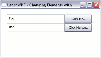
On windows XP with the silver theme the window will appear as shown below:
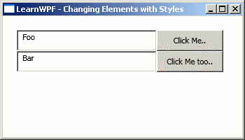
However on Windows XP under the classic windows theme it appears as shown in this second figure:
We can already see that WPF is capable of changing how controls are rendered to suit the context it is running in. So how do we go about defining our own style for the buttons? The following modified version of the form does just that with a Style added to the Resources collection that exists for the window.
Form XAML Code (Feb 06 CTP):
<Window x:Class="LearnWPF.ButtonStyle.Window1"
xmlns="
http://schemas.microsoft.com/winfx/2006/xaml/presentation
"
xmlns:x="
http://schemas.microsoft.com/winfx/2006/xaml
"
Title="LearnWPF - Changing Elements with Styles" Width="350" Height="200">
<Window.Resources>
<Style TargetType="{x:Type Button}">
<Setter Property="Foreground" Value="#58290a" />
<Setter Property="FontFamily" Value="Lucida Console" />
<Setter Property="Background">
<Setter.Value>
<LinearGradientBrush StartPoint="0,0" EndPoint="0,1" >
<LinearGradientBrush.GradientStops>
<GradientStop Color="#feca00" Offset="0.1"/>
<GradientStop Color="#ffe100" Offset="0.4"/>
<GradientStop Color="#feca00" Offset="0.6"/>
<GradientStop Color="Orange" Offset="0.9"/>
</LinearGradientBrush.GradientStops>
</LinearGradientBrush>
</Setter.Value>
</Setter>
</Style>
</Window.Resources>
<Grid Margin="20">
<Grid.ColumnDefinitions>
<ColumnDefinition Width="200"/>
<ColumnDefinition Width="95"/>
</Grid.ColumnDefinitions>
<Grid.RowDefinitions>
<RowDefinition Height="30"/>
<RowDefinition Height="30"/>
</Grid.RowDefinitions>
<TextBox Text="Foo" Grid.Column="0" Grid.Row="0" />
<Button Content="Click Me.." Grid.Column="1" Grid.Row="0"/>
<TextBox Text="Bar" Grid.Column="0" Grid.Row="1" />
<Button Content="Click Me too.." Grid.Column="1" Grid.Row="1"/>
</Grid>
</Window>
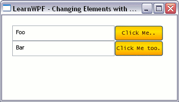
The first attribute of the Style that is set is the TargetType, setting this to {x:Type Button} as is being done in the sample above tells WPF that this style should be used for all elements of type Button on the form unless another style is specified explicitly for them. This style sets the Foreground and FontFamily properties of the button to simple values that can be specified in a single string. It also specifies a linear gradient for the Background of the buttons. Because this cannot be specified as a single string the Property Element syntax of WPF is used - when setting a complex property a nested child element is created and the element is given the name of the parent element followed by the name of the property you wish to set. With this style applied the form renders as shown below:
This style merely sets some properties on the button - which we could have achieved ourselves by painstakingly setting properties on all our button controls in XAML. Clearly this approach with styles is better - it declaratively specifies the look we want for our button in a single place. What about going further and totally replacing the way the button renders? We can also do this in a style, be specifying a new Template for the element we want to replace. The Template defines how the element renders itself out. In this modified version of the form below we define a new template for the buttons on our form, which gives us rounded, gel-like buttons.
Form XAML Code (Feb 06 CTP):
<Window x:Class="LearnWPF.ButtonStyle.Window1"
xmlns="
http://schemas.microsoft.com/winfx/2006/xaml/presentation
"
xmlns:x="
http://schemas.microsoft.com/winfx/2006/xaml
"
Title="LearnWPF - Changing Elements with Styles" Width="350" Height="200">
<Window.Resources>
<Style TargetType="{x:Type Button}">
<Setter Property="Template">
<Setter.Value>
<ControlTemplate TargetType="{x:Type Button}">
<Grid HorizontalAlignment="Stretch" VerticalAlignment="Stretch" ClipToBounds="False">
<Grid.RowDefinitions>
<RowDefinition />
<RowDefinition />
</Grid.RowDefinitions>
<!-- the background for the button -->
<Rectangle RadiusX="15" RadiusY="10" Grid.RowSpan="2">
<Rectangle.Fill>
<LinearGradientBrush StartPoint="0,0" EndPoint="0,1" >
<LinearGradientBrush.GradientStops>
<GradientStop Color="#feca00" Offset="0"/>
<GradientStop Color="Orange" Offset="0.9"/>
</LinearGradientBrush.GradientStops>
</LinearGradientBrush>
</Rectangle.Fill>
</Rectangle>
<!-- the "gel" hilight at the top of the button -->
<Rectangle RadiusX="7" RadiusY="6" Margin="2">
<Rectangle.Fill>
<LinearGradientBrush StartPoint="0,0" EndPoint="0,1" >
<LinearGradientBrush.GradientStops>
<GradientStop Color="#fff399" Offset="0.1"/>
<GradientStop Color="#ffe100" Offset="0.5"/>
<GradientStop Color="#feca00" Offset="0.9"/>
</LinearGradientBrush.GradientStops>
</LinearGradientBrush>
</Rectangle.Fill>
</Rectangle>
<!-- place for the content inside the button to be displayed -->
<ContentPresenter Grid.RowSpan="2"
x:Name="PrimaryContent"
HorizontalAlignment="Center" VerticalAlignment="Center"
Margin="{TemplateBinding Padding}"
Content="{Binding Path=Content, RelativeSource={RelativeSource TemplatedParent}}"
/>
</Grid>
</ControlTemplate>
</Setter.Value>
</Setter>
<Setter Property="Foreground" Value="#58290a" />
<Setter Property="FontFamily" Value="Lucida Console" />
</Style>
</Window.Resources>
<Grid Margin="20">
<Grid.ColumnDefinitions>
<ColumnDefinition Width="200"/>
<ColumnDefinition Width="95"/>
</Grid.ColumnDefinitions>
<Grid.RowDefinitions>
<RowDefinition Height="30"/>
<RowDefinition Height="30"/>
</Grid.RowDefinitions>
<TextBox Text="Foo" Grid.Column="0" Grid.Row="0" />
<Button Content="Click Me.." Grid.Column="1" Grid.Row="0"/>
<TextBox Text="Bar" Grid.Column="0" Grid.Row="1" />
<Button Content="Click Me too.." Grid.Column="1" Grid.Row="1"/>
</Grid>
</Window>
The appearance of the form is shown below:
If you run the sample you'll see some unfortunate shortcomings with this template - for example it gives no visual indication when the button is clicked however it does demonstrate the power of styles to fully replace the rendering of a control. For a more fully-featured template example (built against the January CTP) you should study Robert Ingebretsen's Orange Shiny Button template which was recently featured on MSDN TV, and for more aesthetically appealing gel buttons have a look at Valentin Iliescu's WPF Aqua Gel button tutorial. For further information on Styles and control templates you should also read chapter 5 of "Programming Windows Presentation Foundation" - this chapter is available for free download.
How do I change the look of all the buttons on a form in WPF? | Kinect Developer | Scoop.it