Recap – What’s new in WPF 4.5

As Visual Studio 2012, .NET 4.5 and WPF 4.5 near release (I believe there is some kind of minor windows release going out at the same time too) you might be asking what is new in WPF 4.5? For those looking for a refresher, or if you missed it the first time around you should check out Pete Brown’s video and sample code form DEV335, his session from Tech.Ed 2012 (USA Edition) where he covers a bunch of interesting things including:

  • async/await and Task<T> support in WPF 4.5
  • Using the built-in ribbon control
  • Data Binding improvements (delay, expression information)
  • Weak References for Events
  • Stuff lifted from Silverlight (INotifyDataErrorInfo, ICustomTypeProvider)
  • Collection changes from non-UI threads
  • Live shaping of collections

»

Author image

Adding an Icon and File Association to WPF Clickonce Applications

Although Clickonce applications originally did not have support for file associations, recent releases of the .NET framework and WPF have allowed Clickonce applications to be associated with a file extension, and for your Clickonce application icon to become the icon for that file in the windows shell.

Creating the File Association

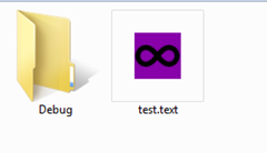
The first step is to add an icon file to your project. We’ve chosen a rather garish visual-studio-cum-metro icon (based on this nice infinity icon from the noun project and courtesy of Michael Pangilinan). This is the icon you want files associated with your application to use. The build action of the icon should be ‘Content’

add_icon

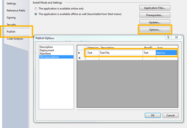
The second step is to configure the file association in Clickonce. This can be done in your application by selecting the project properties, going into the Publish tab (where Clickonce settings are usually set) and choosing ‘Options’ –> ‘File Associations’. Here you enter the extension you want to associate with your Clickonce app, providing a description, and choosing the icon you want to use.

properties

You can also verify at this point that your icon is going to be copied to the Clickonce output as part of your application by choosing ‘Application Files’ and verifying that the icon file is there.

include_icon

If we publish and install our Clickonce application, and then create a .Text file (the file extension we made up) in an empty directory it should appear with our garish purple visual studio icon, and double-clicking on it should launch our test application.

association

Opening the File

The next step is to add some code to get access to the file name that is passed to our application. The file is not passed to the app.xaml as an array of strings, like normal command-line arguments. Instead we interrogate the SetupInformation.ActivationArguments.ActivationData property of the current app domain when our application has launched, which will contain the URI to the file.

string[] activationData = 
  AppDomain.CurrentDomain.SetupInformation.ActivationArguments.ActivationData;

If the user has launched your app by clicking on an associated file the first element of the activation data will be a file:// URI pointing to the file. Use the Uri.LocalPath property to convert the URI to a traditional windows file path, which you can then read or open as you wish. A sample project showing all of this working is available as part of my LearnWPF Samples Project on BitBucket.

»

Author image

Silverlight Automated UI Testing With Selenium

Silverlight certainly isn’t receiving any love at the moment from Microsoft now that the new and shiny WinRT has been announced, however there are still lots of sites and applications built and being built with silverlight. If you look at the list of supported configurations for Coded UI tests you won’t see Silverlight 5 on there (although it kind-of works, like Silverlight 4) there is no plans for adding Silverlight 5 support in Visual Studio 2012. Fortunately, or perhaps because of a few accidents of history, it is possible to test Silverlight 5 UI with Selenium, and once set up the result might actually be superior to the UI automation provided by coded UI. Unfortunately the set-up was a little tricky (hence this blog post) but once you understand the mechanism for the communication it all falls into place pretty nicely. Firstly some context.

Background: Selenium

[If you’re familiar with Selenium WebDriver you can probably skip this part] Selenium is a browser automation system that is primarily used to test web applications (but it could be used to automate boring tasks like filling in your timesheets in triplicate in three different systems, hypothetically of course…hypothetically). Selenium has a number of sub-projects that are quite interesting but from the point-of-view of Silverlight automation the WebDriver project is a means of automating a real browser (like Chrome, IE or Firefox) running out-of-process, and maybe even on a different machine, from within your code. Your C# code communicates with the browser using the C# language binding for Silenium which sends messages via HTTP – Selenium sets up a plug-in specific to each browser that runs in the browser and listens for messages in Selenese, which it translates into instructions to the browser. If an ‘api’ isn’t available for doing what it needs to do with the browser it falls back to Javascript. More background on Selenium WebDriver can be found here.

So at this stage we have something that looks like this:

selenium

Silverlight-Selenium

Silverlight-Selenium allows you to test your Silverilght UI running ‘in-browser’ using Selenium. On the client you adding a container around your regular Silverlight UI. You then expose that container and methods on it to browser scripting via the [ScriptableType] tag. Silverlight-Selenium provides a sample container and some helper classes for interacting with your UI you want to test. In your test code Silverlight-Selenium gives you a fairly normal-looking API to interact with, while underneath it builds up javascript statements which it sends through to the browser. The browser evaluates them, and the [ScriptableType] attribute allows the javascript to call methods on your UI code under test.

selenium2

The great thing about this approach is that once you understand how it works there is very little ‘magic’ involved. Your C# test code builds up Javascript strings, which get sent via HTTP to a browser plug-in, which evaluates them and forwards them on to your Silverlight C# code running in the same browser. You can see the Javascript being invoked, and with modern browser development tools you can open up a script console and tweak/test the javascript that Silverlight-Selenium is generating (albeit in a different process). You can also set breakpoints in the C# test code (running inside NUnit testrunner, MSTest Runner etc) and in the Silverlight UI and break in both. Also because the test-side Silverlight Selenium is just C# you can modify that to suit your needs as well, or use ‘as-is’.

On the client one big advantage is you can use the visual tree to ‘find’ UI elements and read their properties (useful for the verification part of tests). This is often an issue in other UI Test Frameworks that sit on top of MSAA or UIA – accessibility attributes need to be set so that automation tools can find the elements, and WPF and silverlight do strange things with some UI Elements like textblocks and the like inside data templates, which make them opaque to accessibility (and UI Automation tools). This approach neatly side-steps this issue. If it is in the visual tree then your ‘helper’ classes can get to it, and you can test it.

»

Author image

A Message & Actor Based UI Architecture for WPF using 0MQ

It’s hard to talk about WPF UI architecture without talking about MVVM, so lets start there, shall we? The MVVM pattern (or presentation model) deals with a number of things, but concurrency isn’t one of them (and perhaps nor should it). When applying the Presentation Model to WPF there is a certain amount of discomfort to be felt, particularly when dealing with modifying collections from non-UI threads, but for the most part we’re left to our own devices using the WPF dispatcher, and the usual suspects of synchronization primitives like threads, locks and mutexes. Although Microsoft has been improving the experience for developers with recent releases like the Task Parallel Library and Reactive Extensions, and this has been built on with libraries like Reactive UI none of these (to my mind at least) attacks the problem of shared state.

The Fractal Application Architecture

With this in mind I started looking at a way of structuring the UI for WPF applications that is in many ways akin to the way many distributed ‘enterprise’ applications are architected – using and actor model a message publishing and subscription model (AKA PUB/SUB) or message bus.

The Simplest thing that could Possibly Work

What I’ve come up with so far is pretty under-whelming but I’m hoping to build on this to create something that is actually useful. My current sample application doesn’t use MVVM, data binding or anything like that, but merely looks at setting up some message passing infrastructure using 0MQ, allowing two threads running in the same process to send messages to each-other, where one of those threads is driving a WPF UI.

You can view all the pertinent source code in a single file here or get the latest source as part of my learnwpf.com samples project on bitbucket.

Further Work

In the fullness of time I’d like to build up an example that deals with

  • passing data types more complex than just strings
  • integration with MVVM and other traditional WPF patterns and idioms.
  • handles different messaging styles including pub/sub, push/pull etc.
  • reliability improvements so that exceptions in a single service/actor don’t bring down the whole process.
  • experiment with moving some actors out-of-process (Location Transparency)

You can insert your favourite quote about most complicated concurrent programs having half a poor erlang implementation in them somewhere here.

»

Author image

Flexible Metro-style icons in WPF with Embedded Fonts

A recent trend in web development is the use of font families (like, for example Font-Awesome, which was built to work with the twitter bootstrap CSS framework) instead of images for small icons in web sites. This technique removes the need for optimization techniques like CSS sprites and providing resolution independence[1]. However one downside is that it only works with monochromatic icons. Enter Microsoft’s ascendant Metro design language, heavily inspired by signage and mandating simple monochromatic icons. As rich-client developers we can use this technique too, and it’s a match made in asset-embedding heaven.

metro_small


Creating or Choosing a set of icons

This decision boils down to either using a set of font icons you can live with (and have the rights to redistribute) or creating your own. Windows has come with several icon fonts for a long time now – the likes of Wingdings and Webdings, although these are a bit dated-looking and are unlikely to meet your needs. The afore-mentioned Font-Awesome is a good starting point, and as Jeremy Likness points out Windows 8 features a new font icon called Segoe UI Symbol which is a great choice for WinRT metro applications. Although Segoe UI Symbol was first included in Windows 7 it has undergone substantial improvement and enhancement in Windows 8, highlighting another issue with fonts you don’t explicitly provide – the characters can change!

The second approach is to create your own font (probably easiest from SVG images like those found on thenonproject.com, or create your own). Inkscape can be used to do this by creating an SVG font, and then using an online tool like the online font converter to convert it into a TTF font which can be embedded in your application. The process for doing this is a bit more involved so you but is covered in detail in this article and helpful video.


Using the font

Once you’ve chosen the font to use actually using it is very easy. If you’re using a font which is not already installed on the user’s computer (which is highly likely) you use the regular font embedding techniques for WPF applications. I’ve created a sample project called FontIcons as part of my learnwpf.samples project on bitbucket, which as a version of the Font-Awesome font-set embedded. [2]

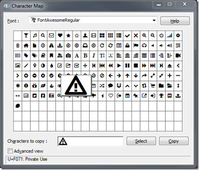
the charmap utility built into windows can be used to find the hexidecimal representation for the character/icon you want to use.

charmap

The XAML markup 

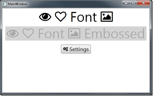
<TextBlock Style="{StaticResource Icon}" Text="&#xF06E; &#xF08A; Font &#xF03E;" />

creates the “I Love Font Images” text shown in the screen-shot of the sample application below, when used in conjunction with the Font-Awesome font-face.

app

As the screen-shot of the sample application also shows you can create a kind of embossed effect with a drop-shadow positioned 1px immediately below the icons.

Notes

[1] For true resolution independence for font images the font author needs to do some work when designing the font, but you would have had to do this anyway for scale-able images too.

[2] The version of font-awesome that I embedded is not the same one you can download from their site. The one they have for download is a web TTF, and can’t be installed as a font on windows, or embedded in your WPF application. You will need to do as I did and use a tool like the online font converter to change it to a regular TTF file.

»

Author image

Pure XAML pre-loader/indeterminate progress indicator for WPF

A colleague of mine was looking for a WPF pre-loader, so I created this one.

It is stand-alone in single XAML file, and doesn’t require any C# code, so it should be easy to re-use (although it could be made much less verbose with a little C#). It works by animating the background color, and opacity of 12 border elements that have been placed in a circle using a rotate transform. The appearance of the border, background color, duration of the animation, and the ‘spread’ of the elements have all been parameterized for easy tweaking. One thing that is not parameterized (because it varies for each element) is the rotate transform, and the time animation time delay for each of the 12 elements. These need to be edited for each element. The source-code is here, and has been included in my learnwpf.com samples project on bitbucket.

»

Author image

Subtle Texture Patterns suitable for backgrounds in your WPF application

I mentioned not long ago about the use of digital noise for creating textured backgrounds in WPF applications. While noise can be appealing, it is just one of the many kinds of textures you can use in your application. While some can be created programmatically like our noise was many are created from scratch using image editing tools, or from photos or scans of real-life objects.

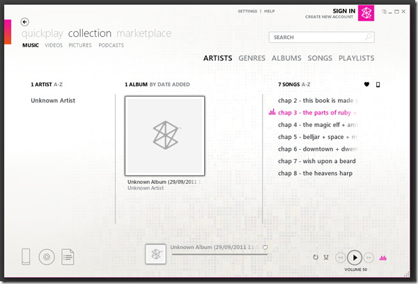
Atle Mo has created a nice site for sharing pattern textures, called (appropriately enough) subtlepatterns.com. The hard thing (for me) about creating these kinds of things from scratch is making them tile well, and the contributors to the site have saved us all the effort. The site allows you to preview the patterns as backgrounds for the site itself, they are all licensed under the very permissive Creative Commons 3.0 Unported license which allows both commercial and free use of the patterns. It is well worth checking out. And just in case you’re thinking textures and patterns have no place in modern metro design have a look at this screen shot of the zune player for some inspiration.

zune_watermark2

»

Author image

Troubleshooting Layout Problems in WPF

The WPF layout system is very, very good. I find it infinitely better than CSS for layout, but occasionally (very occasionally) things don’t quite work out the way you want which is where the list of tips and tricks comes in.

Grid (and maybe StackPanel)

First off let me offer a suggestion. For all things layout, start with the Grid. Except for the WrapPanel (and other custom panels you may have made) the Grid is the ‘super-set’ of layout panels. It is no accident that the default root layout container that Expression Blend and Visual Studio add to every Window and UserControl is the Grid. Use auto-sized rows and columns for things that you want to only take up as much room as they need. Use star (*) sizing for things you want to be as big as possible. Use column and row spanning to reduce the number of grids you need to use, and the need for nested grids.  Add grid splitters to allow the users to re-size parts of the grid. If you want to have multiple grids that share column widths look at shared size groups.

Although there certainly are some cases where I use other types of panels the grid is an excellent default, followed (distantly) by the StackPanel which can be good for very simple layouts. WrapPanel has a very specific niche use. I’d treat the use of other panels with some circumspection.

Snoop is your friend

As with almost all things WPF Snoop is your friend and an indispensible utility for looking in to layout problems. The first great thing about snoop is that you can interactively change the layout properties of elements in a running application and observe what effect it has on the layout. The can be very useful if it takes a number of steps to get your UI into the state where it is having the problem, because you can investigate the effects of changing a number of different properties without re-compiling your application.

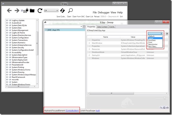
When investigating layout issues with snoop one technique is to simply walk the visual tree of elements looking for elements with un-usual or unexpected layout properties. There are many properties that effect layout, and until recently no way in snoop to select a group of properties to view, however this has been addressed in recent builds. By dropping down the combo box on the top-right of the screen (with the red rectangle shown below) we can look at just the layout-related properties. Snoop allows you to define custom lists of properties you want to see (by selecting the ‘Edit Filters’ option at the bottom of the list). I usually do this and add properties like VerticalAlignment, VerticalContentAlignment etc. to the list when debugging layout issues, as these properties can also effect layout.
layout_debugging_snoop

Snoop also allows you to hold down CTRL+SHIFT and mouse over elements of interest (selecting them in the tree-view on the left and allowing you to view their properties) or click on the link at the bottom of the window in snoop to select the item that currently has keyboard focus in the tree.

Simplify

The more complex the layout the more difficult it will be to troubleshoot layout problems. Often an inability to bend a layout to your will can be a sign that things have become too complicated, and a good first step in fixing a layout problem can be to look to dramatically simplify. Fortunately Blend and Visual Studio often leave lots of low-hanging fruit – you should be looking to remove redundant nested panels, such as grids nested immediately inside other panels, panels with only 1 child, and redundant attributes. Also be on the look-out for redundant transforms. Use VerticalAlignment and HorizontalAlignment where appropriate to avoid complicated margins and nested elements.

Avoid fixed sizes for things

The root cause of many layout problems is fixed sizes being applied (or rather mis-applied) to elements, with unintended consequences on the element (when the content changes) or around it. Many of these kinds of problems can be avoided altogether by just not setting absolute sizes on things. Absolute values are completely appropriate for margins and padding values, but you should treat absolute size values for content elements with suspicion. Instead a combination of correct use of the Grid, consideration of vertical and horizontal alignments, and appropriate margins and padding can usually achieve anything that is required. One exception to this guideline is images that are compiled in to the application – the sizes of these are known in advance, and can be set in the XAML or code.

Build a Prototype

I know it sounds trite and obvious, but one of the best things to do is fire up Kaxaml and create the simplest version of what you’re trying to create. Does that work? If not, why not?

»
Author image

Office 2010-style Window Header with WPF and Microsoft.Windows.Shell

The more observant among you probably noticed one huge difference with Office 2010 and its predecessor when it was launched – a totally sweet white gradient in the ‘glassy’ area at the top of the window.

Word2010Ribbon_with_callout_small

Fortunately with WPF and the WPF Shell Integration Library (which manifests itself in the Microsoft.Windows.Shell namespace) we can also create an effect like this.

WPF allows us to re-template a Window fairly easily, and the Shell Integration Library has an easy declarative way to specify how much Aero Glass we want on each edge of our window. Here we’re asking for 9 pixels of aero glass on each edge of the window except at the top.

<Setter Property="shell:WindowChrome.WindowChrome">
  <Setter.Value>    <shell:WindowChrome GlassFrameThickness="9 54 9 9" />
  </Setter.Value>
</Setter>

The value of 9 corresponds to the system-specified non-client margin on the left, right and bottom of the window. The WPF Shell Integration Library also exposes this value programmatically via the SystemParameters2.WindowNonClientFrameThickness property (it can be changed via a registry entry, and varies between windows versions). For demonstration purposes I’ve hard-coded it here.

Once we’ve specified how much aero glass we want at the top, we just add a rectangle with a ‘transparent-to-white’ vertical gradient as it’s background at the top of the window template and without too much effort (and all done in XAML) we have something that serves as a good starting point for office-2010-style apps. As with previous samples the code for this demo is included in my learnwpf.com.samples project on bitbucket.

WPFSampleApp

»

Author image