In a previous how-to we looked at WPF's styling capabilities. In this example we are going to use styles to change the appearance of an element when the mouse moves over it. This is easily accomplished using a facility in WPF called triggers. Triggers can "watch" certain special object properties in WPF (called dependency properties), and when they change the appearance of the object can be updated. Most properties that WPF UI Elements expose are dependency properties. Triggers can also "fire" based on events, or on changes to data, but for this example we're only going to look at the simple case of an trigger changing as a result of an object property change.
Below is an updated version of the button style we created in a previous how-to. We have added a trigger that is activated when the IsMouseOver property (which the Button object inherits from its parent UIElement) has a value of true.
<Window x:Class="ButtonWithOuterGlow.Window1"
xmlns="
http://schemas.microsoft.com/winfx/2006/xaml/presentation
"
xmlns:x="
http://schemas.microsoft.com/winfx/2006/xaml
"
Title="LearnWPF - Button with Outer Glow" Height="200" Width="400"
>
<Window.Resources>
<Style TargetType="{x:Type Button}">
<Setter Property="Foreground" Value="#58290a" />
<Setter Property="FontFamily" Value="Lucida Console" />
<Setter Property="Background">
<Setter.Value>
<LinearGradientBrush StartPoint="0,0" EndPoint="0,1" >
<LinearGradientBrush.GradientStops>
<GradientStop Color="#feca00" Offset="0.1"/>
<GradientStop Color="#ffe100" Offset="0.4"/>
<GradientStop Color="#feca00" Offset="0.6"/>
<GradientStop Color="Orange" Offset="0.9"/>
</LinearGradientBrush.GradientStops>
</LinearGradientBrush>
</Setter.Value>
</Setter>
<Style.Triggers>
<Trigger Property="IsMouseOver" Value="True">
<Setter Property="BitmapEffect">
<Setter.Value>
<OuterGlowBitmapEffect GlowColor="Red" GlowSize="4"/>
</Setter.Value>
</Setter>
</Trigger>
</Style.Triggers>
</Style>
</Window.Resources>
<Grid Margin="20">
<Grid.ColumnDefinitions>
<ColumnDefinition Width="50"/>
<ColumnDefinition Width="2*"/>
<ColumnDefinition/>
</Grid.ColumnDefinitions>
<Grid.RowDefinitions>
<RowDefinition/>
</Grid.RowDefinitions>
<Label Content="Field 1" Grid.Column="0" Grid.Row="0"
Height="25"/>
<TextBox Text="Some text goes here" Grid.Column="1"
Grid.Row="0" Height="25"/>
<Button Grid.Column="2" Grid.Row="0" Content="Click me"
Height="25" Margin="5"/>
</Grid>
</Window>
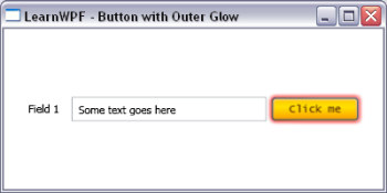
In this example we are changing the appearance of the button by adding an OuterGlowBitmapEffect to the button. This gives the button a colored halo. There are a number of other interesting bitmap effects that can be applied to UI Elements including Blur and DropShadow. The screen-shot below shows the appearance of the button when the mouse moves over it and the trigger is activated.
How do I change an item’s appearance on mouseover in WPF? | Kinect Developer | Scoop.it