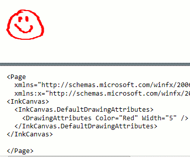
WPF’s InkCanvas control provides a quick and easy way to add ink input to your application. By default the strokes in the InkCanvas are thin black lines, which may be too thin or difficult to see in some instances. Fortunately the appearance of the strokes can easily be changed by modifying the DefaultDrawingAttributes property of the InkCanvas which is of type DrawingAttributes.
<InkCanvas>
<InkCanvas.DefaultDrawingAttributes>
<DrawingAttributes Color="Red" Width="5" />
</InkCanvas.DefaultDrawingAttributes>
</InkCanvas>
The DrawingAttributes has a number of other interesting properties, such as the FitToCurve property which makes lines drawn in the canvas smoother. It is set to false by default. This property seems to have less of an effect when using a tablet input device. When “drawing” with the mouse you can notice the difference more easily.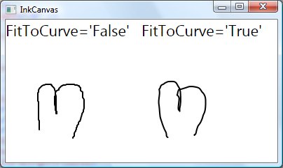
Setting the IsHighlighter property to true causes the strokes to be drawn semi-transparently to allow content behind them to show through.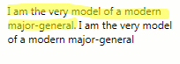
The IgnorePressure property defaults to false and uses pressure information from devices capable of sending it (like input tablets) to alter the thickness of the line.
You can also set the shape of the stylus tip to rectangular or elliptical by setting the StylusTip property.