How do I bind to XML data in WPF?

WPF has good built-in support for binding to different kinds of data, including XML. In this very simple example we're going to declare a small "island" of XML data in our UI, and bind some text properties to parts of the XML document. Then we'll look at binding to XML documents loaded from other sources. We declare the XML data island by adding an XmlDataProvider to the resources collection of our window. »

Author image

How can I decompile/extract a WPF Control's default template as Xaml?

The rendering of controls in WPF is defined by the template used for the control. In a previous posting we saw how to supply our own template for a control to customize the rendering. It is not un-common to want to make some small modifications to the default template for an existing control, or wonder how a certain effect is achieved in the default template of a given control. Wouldn't it be great if you could somehow extract the Xaml code for default template out of a control and see how it worked? »

Author image

How can I install the Feb CTP of the Windows SDK when the installer keeps failing?

A few colleagues and posters to the WPF Forum have reported problems with the Feb CTP of the Windows SDK installing. The error message they've given is something like: Windows SDK Setup (failed): Installation of the "Microsoft Windows Software Development Kit" product has reported the following error: Fatal error during installation. The Windows SDK can be installed in two different ways - by downloading a 217 KB setup executable that then downloads and installs the necessary components, or by downloading a 1089 MB img (CD image) of the SDK and installing from there. »

Author image

How do I create WPF graphics using the Expression Graphic Designer?

The Expression Graphic Designer (code-named Acrylic) is capable of saving out assets to Xaml using the File > Export > Xaml Export from the main menu. The assets can be exported as elements in a canvas, or as a resource (suitable for embedding in your application). Unfortunately unlike the Expression Interactive Designer (code-named Sparkle) Xaml is not the "native format" of Acrylic, so the export process is one-way. The representation in Xaml is quite good however, even for assets that contain both vector and raster (bitmap) layers. »

Author image

Expression Interactive Designer March CTP Available

The March CTP of the Expression Interactive Designer has been released. It is built against the February CTP of WinFx. You can download the March CTP of the Expression Interactive Designer here. The Expression Interactive Designer (code-named Sparkle) is a design tool for creating WPF interfaces, and allows you to create UI without having to know Xaml syntax. Also of interest to WPF developers, the Expression Interactive Designer was written in WPF. »

Author image

Can I create 'Aero Glass'-style windows under Windows XP in WPF?

Aero Glass is a new theme being launched in Windows Vista. Under Aero Glass the borders and title bar of the form take on a translucent, glass-like appearance. When your WPF applications run on Windows Vista (and the Aero Glass theme is enabled) your windows will automatically be drawn this way. Is it possible to use WPF styles so that windows look like the Aero Glass theme, even when they are not running on Vista? »

Author image

How do I change an item's appearance on mouseover in WPF?

In a previous how-to we looked at WPF's styling capabilities. In this example we are going to use styles to change the appearance of an element when the mouse moves over it. This is easily accomplished using a facility in WPF called triggers. Triggers can "watch" certain special object properties in WPF (called dependency properties), and when they change the appearance of the object can be updated. Most properties that WPF UI Elements expose are dependency properties. Triggers can also "fire" based on events, or on changes to data, but for this example we're only going to look at the simple case of an trigger changing as a result of an object property change.

Below is an updated version of the button style we created in a previous how-to. We have added a trigger that is activated when the IsMouseOver property (which the Button object inherits from its parent UIElement) has a value of true.

<Window x:Class="ButtonWithOuterGlow.Window1"
    xmlns="
http://schemas.microsoft.com/winfx/2006/xaml/presentation "
    xmlns:x="
http://schemas.microsoft.com/winfx/2006/xaml "
    Title="LearnWPF - Button with Outer Glow" Height="200" Width="400"
    >
  <Window.Resources>
    <Style TargetType="{x:Type Button}">
      <Setter Property="Foreground" Value="#58290a" />
      <Setter Property="FontFamily" Value="Lucida Console" />
      <Setter Property="Background">
        <Setter.Value>
          <LinearGradientBrush StartPoint="0,0" EndPoint="0,1" >
            <LinearGradientBrush.GradientStops>
              <GradientStop Color="#feca00" Offset="0.1"/>
              <GradientStop Color="#ffe100" Offset="0.4"/>
              <GradientStop Color="#feca00" Offset="0.6"/>
              <GradientStop Color="Orange" Offset="0.9"/>
            </LinearGradientBrush.GradientStops>
          </LinearGradientBrush>
        </Setter.Value>
      </Setter>
      <Style.Triggers>
        <Trigger Property="IsMouseOver" Value="True">
          <Setter Property="BitmapEffect">
            <Setter.Value>
              <OuterGlowBitmapEffect GlowColor="Red" GlowSize="4"/>
            </Setter.Value>
          </Setter>
        </Trigger>
      </Style.Triggers>
    </Style>
  </Window.Resources>
  <Grid Margin="20">
    <Grid.ColumnDefinitions>
      <ColumnDefinition Width="50"/>
      <ColumnDefinition Width="2*"/>
      <ColumnDefinition/>
    </Grid.ColumnDefinitions>
    <Grid.RowDefinitions>
      <RowDefinition/>
    </Grid.RowDefinitions>
    <Label Content="Field 1" Grid.Column="0" Grid.Row="0"
           Height="25"/>
    <TextBox Text="Some text goes here" Grid.Column="1"
             Grid.Row="0" Height="25"/>
    <Button Grid.Column="2" Grid.Row="0" Content="Click me"
            Height="25" Margin="5"/>
  </Grid>
</Window>

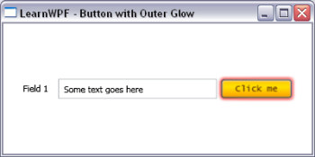
In this example we are changing the appearance of the button by adding an OuterGlowBitmapEffect to the button. This gives the button a colored halo. There are a number of other interesting bitmap effects that can be applied to UI Elements including Blur and DropShadow. The screen-shot below shows the appearance of the button when the mouse moves over it and the trigger is activated.

Button with outer glow applied

»

Author image

How do I change the look of all the buttons on a form in WPF?

WPF allows you to specify the appearance of UI elements in a single place, and re-use that "look" in multiple places - either across a form or across your whole application. This mechanism is called styles. They are similar to the styles available in web development in CSS, but more powerful because they can not only be used to change the properties of a UI element (such as a button), they can be used to completely re-define how the control is rendered. They are also declared using XAML, rather than a seperate language like CSS.

The techniques shown below are in no way limited to buttons - you can use styles to change or even completely define the rendering of any WPF controls. The intention with WPF is that controls like button define a behavior, and a default rendering but allow the developer/designer to completely replace the "look" if they wish. For this reason WPF controls are sometimes referred to as "look-less" controls.

Enough theory - how would we use WPF styles to replace the rendering of all the buttons on a form? First lets create a form with two text boxes and two buttons in a grid. We want to define the style for the buttons in a single place and have it automatically applied to the two buttons.

Form XAML Code (Feb 06 CTP):

<Window x:Class="LearnWPF.ButtonStyle.Window1"
    xmlns="
http://schemas.microsoft.com/winfx/2006/xaml/presentation "
    xmlns:x="
http://schemas.microsoft.com/winfx/2006/xaml "
    Title="LearnWPF - Changing Elements with Styles"
    Width="350" Height="200"> 
    <Grid Margin="20">
      <Grid.ColumnDefinitions>
        <ColumnDefinition Width="200"/>
        <ColumnDefinition Width="95"/>
      </Grid.ColumnDefinitions>
      <Grid.RowDefinitions>
        <RowDefinition Height="30"/>
        <RowDefinition Height="30"/>
      </Grid.RowDefinitions>
      <TextBox Text="Foo" Grid.Column="0" Grid.Row="0" />
      <Button Content="Click Me.." Grid.Column="1" Grid.Row="0"/>
      <TextBox Text="Bar" Grid.Column="0" Grid.Row="1" />
      <Button Content="Click Me too.." Grid.Column="1" Grid.Row="1"/>
    </Grid>
</Window>

On windows XP with the silver theme the window will appear as shown below:
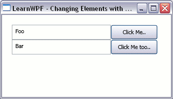
A simple form with 2 buttons on Windows XP

However on Windows XP under the classic windows theme it appears as shown in this second figure:
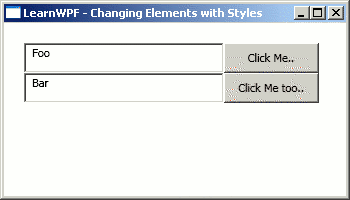
Simple form with two buttons under windows classic theme

We can already see that WPF is capable of changing how controls are rendered to suit the context it is running in. So how do we go about defining our own style for the buttons? The following modified version of the form does just that with a Style added to the Resources collection that exists for the window.

Form XAML Code (Feb 06 CTP):

<Window x:Class="LearnWPF.ButtonStyle.Window1"
    xmlns="
http://schemas.microsoft.com/winfx/2006/xaml/presentation "
    xmlns:x="
http://schemas.microsoft.com/winfx/2006/xaml "
    Title="LearnWPF - Changing Elements with Styles" Width="350" Height="200">
  <Window.Resources>
    <Style TargetType="{x:Type Button}">
      <Setter Property="Foreground" Value="#58290a" />
      <Setter Property="FontFamily" Value="Lucida Console" />
      <Setter Property="Background">
        <Setter.Value>
          <LinearGradientBrush StartPoint="0,0" EndPoint="0,1" >
            <LinearGradientBrush.GradientStops>
              <GradientStop Color="#feca00" Offset="0.1"/>
              <GradientStop Color="#ffe100" Offset="0.4"/>
              <GradientStop Color="#feca00" Offset="0.6"/>
              <GradientStop Color="Orange" Offset="0.9"/>
            </LinearGradientBrush.GradientStops>
          </LinearGradientBrush>
        </Setter.Value>
      </Setter>
    </Style>
  </Window.Resources>
    <Grid Margin="20">
      <Grid.ColumnDefinitions>
        <ColumnDefinition Width="200"/>
        <ColumnDefinition Width="95"/>
      </Grid.ColumnDefinitions>
      <Grid.RowDefinitions>
        <RowDefinition Height="30"/>
        <RowDefinition Height="30"/>
      </Grid.RowDefinitions>
      <TextBox Text="Foo" Grid.Column="0" Grid.Row="0" />
      <Button Content="Click Me.." Grid.Column="1" Grid.Row="0"/>
      <TextBox Text="Bar" Grid.Column="0" Grid.Row="1" />
      <Button Content="Click Me too.." Grid.Column="1" Grid.Row="1"/>
    </Grid>
</Window>

The first attribute of the Style that is set is the TargetType, setting this to {x:Type Button} as is being done in the sample above tells WPF that this style should be used for all elements of type Button on the form unless another style is specified explicitly for them. This style sets the Foreground and FontFamily properties of the button to simple values that can be specified in a single string. It also specifies a linear gradient for the Background of the buttons. Because this cannot be specified as a single string the Property Element syntax of WPF is used - when setting a complex property a nested child element is created and the element is given the name of the parent element followed by the name of the property you wish to set. With this style applied the form renders as shown below:
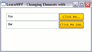
Form with the Style applied

This style merely sets some properties on the button - which we could have achieved ourselves by painstakingly setting properties on all our button controls in XAML. Clearly this approach with styles is better - it declaratively specifies the look we want for our button in a single place. What about going further and totally replacing the way the button renders? We can also do this in a style, be specifying a new Template for the element we want to replace. The Template defines how the element renders itself out. In this modified version of the form below we define a new template for the buttons on our form, which gives us rounded, gel-like buttons.

Form XAML Code (Feb 06 CTP):

<Window x:Class="LearnWPF.ButtonStyle.Window1"
    xmlns="
http://schemas.microsoft.com/winfx/2006/xaml/presentation "
    xmlns:x="
http://schemas.microsoft.com/winfx/2006/xaml "
    Title="LearnWPF - Changing Elements with Styles" Width="350" Height="200">
  <Window.Resources>
    <Style TargetType="{x:Type Button}">
      <Setter Property="Template">
        <Setter.Value>
          <ControlTemplate TargetType="{x:Type Button}">
            <Grid HorizontalAlignment="Stretch" VerticalAlignment="Stretch" ClipToBounds="False">
              <Grid.RowDefinitions>
                <RowDefinition />
                <RowDefinition />
              </Grid.RowDefinitions>
              <!-- the background for the button -->
              <Rectangle RadiusX="15" RadiusY="10" Grid.RowSpan="2">
                <Rectangle.Fill>
                  <LinearGradientBrush StartPoint="0,0" EndPoint="0,1" >
                    <LinearGradientBrush.GradientStops>
                      <GradientStop Color="#feca00" Offset="0"/>
                      <GradientStop Color="Orange" Offset="0.9"/>
                    </LinearGradientBrush.GradientStops>
                  </LinearGradientBrush>
                </Rectangle.Fill>
              </Rectangle>
              <!-- the "gel" hilight at the top of the button -->
              <Rectangle RadiusX="7" RadiusY="6" Margin="2">
                <Rectangle.Fill>
                  <LinearGradientBrush StartPoint="0,0" EndPoint="0,1" >
                    <LinearGradientBrush.GradientStops>
                      <GradientStop Color="#fff399" Offset="0.1"/>
                      <GradientStop Color="#ffe100" Offset="0.5"/>
                      <GradientStop Color="#feca00" Offset="0.9"/>
                    </LinearGradientBrush.GradientStops>
                  </LinearGradientBrush>
                </Rectangle.Fill>
              </Rectangle>
              <!-- place for the content inside the button to be displayed -->
              <ContentPresenter Grid.RowSpan="2"  
              x:Name="PrimaryContent"
              HorizontalAlignment="Center" VerticalAlignment="Center"
              Margin="{TemplateBinding Padding}"
              Content="{Binding Path=Content, RelativeSource={RelativeSource TemplatedParent}}"
              />
            </Grid>
          </ControlTemplate>
        </Setter.Value>
      </Setter>
      <Setter Property="Foreground" Value="#58290a" />
      <Setter Property="FontFamily" Value="Lucida Console" />
    </Style>
  </Window.Resources>
    <Grid Margin="20">
      <Grid.ColumnDefinitions>
        <ColumnDefinition Width="200"/>
        <ColumnDefinition Width="95"/>
      </Grid.ColumnDefinitions>
      <Grid.RowDefinitions>
        <RowDefinition Height="30"/>
        <RowDefinition Height="30"/>
      </Grid.RowDefinitions>
      <TextBox Text="Foo" Grid.Column="0" Grid.Row="0" />
      <Button Content="Click Me.." Grid.Column="1" Grid.Row="0"/>
      <TextBox Text="Bar" Grid.Column="0" Grid.Row="1" />
      <Button Content="Click Me too.." Grid.Column="1" Grid.Row="1"/>
    </Grid>
</Window>

The appearance of the form is shown below:
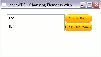
Form with Gel-style buttons

If you run the sample you'll see some unfortunate shortcomings with this template - for example it gives no visual indication when the button is clicked however it does demonstrate the power of styles to fully replace the rendering of a control. For a more fully-featured template example (built against the January CTP) you should study Robert Ingebretsen's Orange Shiny Button template which was recently featured on MSDN TV, and for more aesthetically appealing gel buttons have a look at Valentin Iliescu's WPF Aqua Gel button tutorial. For further information on Styles and control templates you should also read chapter 5 of "Programming Windows Presentation Foundation" - this chapter is available for free download.

»
Author image

New XAML Book - 'XAML in a nutshell' coming from O'Reilly

O'Reilly have another WPF-related book - "XAML in a Nutshell" coming at the end of march/early april. Pre-order on Amazon here. The blurb makes it sound more WPF-centric than purely focusing on XAML: "The Windows Vista operating system will support applications that employ graphics now used by computer games-clear, stunning and active. The cornerstone for building these user interfaces is XAML, the XML-based markup language that works with Windows Presentation Foundation, Vista's new graphics subsystem. »

Author image

I want to bind control values to object properties in WPF – how can I do that?

WPFs data binding capabilities prevent developers having to write the brittle, hard-to-maintain code otherwise required to keep changes in the UI synchronized with changes in their own objects. It also handles conversion between an object’s data types and types that can be displayed in our UI. This example will show the most basic kind of data binding – binding text values for simple UI elements to properties of a .NET object. »

Author image