Virtualizing TreeView for Silverlight, with Diagrams

*Note* If you’re getting a sense of deja vu reading this, it’s because I posed this about 6 months ago, but it was lost when I was migrating it between blog back-ends. I’ve restored it now in it’s full…errr…..glory.

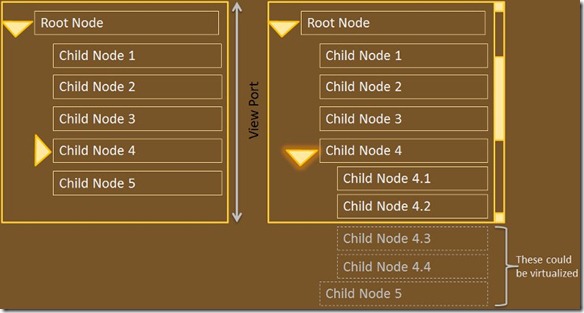
For large hierarchies the TreeView in the Silverlight tool-kit suffers some performance problems, because the elements (once loaded and expanded, such that they could be seen by the user if they scrolled the scroll-bar) aren’t virtualized as aggressively as they could be. The for example the hierarchy shown below: If Child Node 4 is expanded, pushing Child Node 5 outside the limits of the view port of the TreeView then Node 5, as well as any other children of Node 4 that aren’t directly visible, _could_ be virtualized but currently aren’t by the Silverlight Treeview. When the number of invisible-but-loaded nodes is small the performance impact is negligible, but if Node 4 (in the example below) had 10,000 children, each with a complex data template applied to them the performance impact expanding the tree can be quite noticeable.

treeview1

One approach to get around this is to recognize that a TreeView is just a List with indentation and expand/collapse semantics. By flattening your object hierarchy with an appropriate wrapper you can use the virtualization that is built into the ListBox, which happily does virtualize items that have disappeared off the top or the bottom of the list, by virtue of its use of the VirtualizingStackPanel that was added in Silverlight 3. http://msdn.microsoft.com/en-us/library/system.windows.controls.virtualizingstackpanel(VS.95).aspx

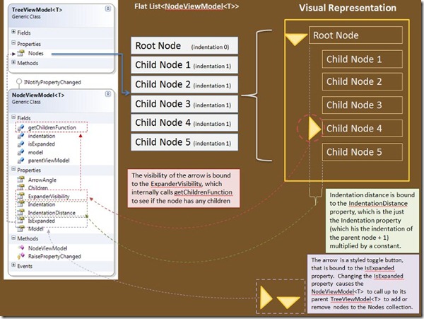
The sample provided does just that with two classes TreeViewModel<T> and NodeViewModel<T>. TreeViewModel<T> contains a Nodes collection, an ObservableCollection of NodeViewModel<T> which the list is bound to. The visibility of the expand/collapse arrow is bound to the presence of children. When a NodeViewModel<T> is expanded it calls back to the TreeViewModel<T> to tell the TreeViewModel to create a new set of NodeViewModels based on the children of the node being expanded, and to insert them directly after node being expanded in the current list of nodes. When the TreeViewModel makes new nodes it increments the indentation property, which is used to drive how far in the node is rendered when it is shown. When a NodeViewModel<T> is collapsed it again calls the TreeViewModel<T> and basically tells it to throw away all the nodes that come after me in the Nodes collection, until you reach one that has the same indentation as me (or you reach the end of the list), at which point the TreeViewModel will know that it has removed all the children of the item that was collapsed.

treeview2

The sample provided is not a complete drop-in replacement for the TreeView control in the Silverlight toolkit. For one thing some of the expand/collapse semantics are a little different to a standard TreeView. For example if all the nodes in the tree are fully expanded, and the root node is collapsed and then re-expanded then the standard tree-view behaviour is for the tree to look the same as before the root node was collapsed, however this tree will only show the direct children of the root node after the root node is collapsed and then re-expanded, regardless of the state of the tree before. This is a side-effect of the way this implementation creates and destroys NodeViewModel<T> instances when a node is collapsed/expanded. When a NodeViewModel<T> is removed from the list of nodes the fact that it was previously expanded is lost. This could be changed by keeping instances of removed nodes around, but would complicate the expand/collapse methods in TreeViewModel<T>. Also some other TreeView standard keyboard short-cuts are missing (for example right arrow to expand a node, and left arrow to contract it) are not wired up. Also it is likely that this technique will become obsolete at some point when the TreeView in the Silverlight Toolkit catches up with the WPF one and implements this trick for itself.

Download Code

»

Author image

I just Upgraded my WPF application from .NET 3.5 to .NET 4 and Now My Images Look Terrible–A Visual Guide to the BitmapScalingMode property.

Although this has been mentioned in other places already, I thought it was worth calling this out specifically as a change from .NET 3.5 to .NET 4. With the release of .NET 4 Microsoft chose to change the default RenderOptions.BitmapScalingMode value from HighQuality to LowQuality. In many other areas the API changes when moving to .NET 4 were ‘opt-in’ so this was a little out-of-the-ordinary.

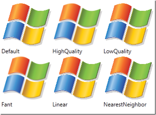
Below is a visual guide to the different types of image scaling modes in WPF v4, along with their names (although as Steve points out in the comments below there are really only 3 options since HighQuality is an alias for Fant, and LowQuality is an alias for Linear).

BitmapScalingModes

This image is 2 x larger than normal, with no interpolation applied during the resize, so it exaggerates the differences between the different scaling modes. How nice an image will look when a particular scaling mode is applied depends largely on the image, so I’ve included the code below. You can plug in an image of your choosing and see how the different scaling modes apply to it.

<Window x:Class="DotNet4ImageScalingMode.MainWindow"
        xmlns="
http://schemas.microsoft.com/winfx/2006/xaml/presentation"
        xmlns:x="http://schemas.microsoft.com/winfx/2006/xaml"
        Title="MainWindow" Height="350" Width="525">
    <Grid Margin="5">
        <Grid.ColumnDefinitions>
            <ColumnDefinition />
            <ColumnDefinition />
            <ColumnDefinition />
            <ColumnDefinition />
            <ColumnDefinition />
            <ColumnDefinition />
        </Grid.ColumnDefinitions>
       
        <Grid.RowDefinitions>
            <RowDefinition Height="Auto" />
            <RowDefinition Height="Auto" />
            <RowDefinition Height="Auto" />
            <RowDefinition Height="Auto" />
        </Grid.RowDefinitions>
       
        <Image Source="winlogo.png" />
        <Image Source="winlogo.png" RenderOptions.BitmapScalingMode="HighQuality" Grid.Column="1" />
        <Image Source="winlogo.png" RenderOptions.BitmapScalingMode="LowQuality" Grid.Column="2" />
        <Image Source="winlogo.png" RenderOptions.BitmapScalingMode="Fant" Grid.Column="0" Grid.Row="2" />
        <Image Source="winlogo.png" RenderOptions.BitmapScalingMode="Linear" Grid.Column="1" Grid.Row="2" />
        <Image Source="winlogo.png" RenderOptions.BitmapScalingMode="NearestNeighbor" Grid.Column="2" Grid.Row="2" />

        <TextBlock Text="Default" Grid.Row="1" />
        <TextBlock Text="HighQuality" Grid.Row="1" Grid.Column="1" />
        <TextBlock Text="LowQuality" Grid.Row="1" Grid.Column="2" />
        <TextBlock Text="Fant" Grid.Row="3" Grid.Column="0" />
        <TextBlock Text="Linear" Grid.Row="3" Grid.Column="1" />
        <TextBlock Text="NearestNeighbor" Grid.Row="3" Grid.Column="2" />
    </Grid>
</Window>

»

Author image

Introducing theMatic–WPF Theme Generation Tool

Doing a custom control theme in WPF is no small undertaking. theMatic (currently very-much-in-alpha) hopes to take some of that pain away, especially for smaller teams that don’t have a dedicated designer, or for quick apps that you still want to give that ‘custom’ touch.

The vision is that you choose a set of control templates (which I collectively refer to as a design), some typography, and a number of colors that make up your theme: colors for control chrome, colors for branding, colors for window foreground text and background. ThemeMatic gives you a live preview of these changes as you make them. Then when you’re done you click ‘Generate’ and out pops a 'theme' assembly that contains all the XAML that describes your theme. You reference this from your main application, and you’re done.

TheMatic is still in definitely alpha – the whole generate process is not done yet, and the three sets of control templates: Simple Styles, JetPack and Cosmopolitan have varying levels of support for the theme colors. It’s a work in progress, but I wanted to give everyone a preview to get some feedback. You can see it in action in this video:

ThemeMatic Preview from Joseph Cooney on Vimeo.

You can download the code from codeplex http://thematic.codeplex.com/ . In time I’d like to add support for more designs (from the WPF themes project), and further refine the current ones (they need a lot of work), but I’d love to know what additional features people would like to see.

Thanks to Scott Barnes for his feedback on how this app should work. Please leave comments here or on the codeplex site if you want to make any suggestions.

»

Author image

Chromatic Aberration Effect with WPF, HLSL, and Lena

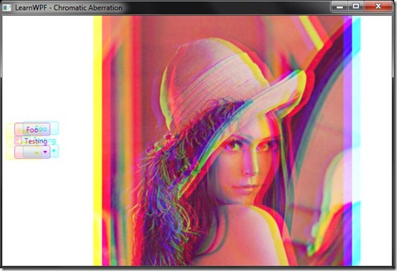
Chromatic aberration can be intentionally added as an artistic effect to production video and design. I have wanted to create a pixel shader effect to do this for some time. When I eventually sat down with Walt Ritscher’s Shazzam shader-effect tool the code I came up with was so simple I was disappointed I’d put off writing it for so long.

ChromaticAberrationWPFLike all effects this will work with controls and UI elements, images and video. You set the R, G and B offsets as ‘points' (so they have an X and Y offset). The RGB offsets can be animated (they’re dependency properties after all). Small offset values tend to look best.

You can download the source and sample application here: LearnWPF.ChromaticAberration.zip (112.46 kb)

»

Author image

LearnWPF, reloaded

After a long hiatus LearnWPF is back on-line. Hopefully with much less spam. I've got some interesting posts scheduled for the next few weeks.

»

Author image

4 Free WPF Utilities I Use Every Day, that come with source!

Here are 4 WPF utilities I use almost daily, that also have the excellent property of coming with source-code included.

Kaxaml icon Kaxaml Kaxaml is a great tool for quick experimentation with snippets of XAML. The editor has intellisense, and the app itself is gorgeous to look at. Written By Robert Ingebretsen you can download the source from codeplex.
shazzam icon Shazzam


Based on the code for Kaxaml this is a nifty app for experimenting and developing pixel shaders, especially for inclusion in WPF applications. It compiles the shaders, builds C#/VB.NET “wrappers” and auto-generates a GUI for editing the shader properties inside of Shazzam (so you can ‘twiddle the knobs’ and see what the effect on the shader is). Developed by Walt Ritscher it can also be downloaded from codeplex.

snoop icon Snoop


Think “firebug for WPF” - Snoop is my favourite application for viewing, editing and inspecting the visual tree of WPF applications. From its irreverent icon down to the many nice little touches in the UI, it is a great app, and I find myself turning to it, usually to get a better understanding of my OWN code rather than anyone elses. Originally written by Peter Blois it is now also hosted on Codeplex.


inkscape logo Inkscape Inkscape is an open-source vector graphics editor, primarily targeting SVG but which in the last couple of versions added support for XAML. I enjoy using the inkscape editor more than I like Expression Design, although I think Expression Design’s XAML output options are better than inkscape. Inkscape is none-the-less a useful tool, especially when working with “raw materials” that aren’t in XAML format. You can download the source form sourceforge.

»

Author image

Adding Simeltaneous Video Recording + Playback to WPFMediaKit's VideoCaptureElement

When it comes to awesome WPF + DirectX video hacks it's Jeremiah Morrill's world, we're just living in it. One of his great contributions to the WPF ecosystem is the WPF Media Kit which adds DVD playback, webcam playback and a number of other capabilities to WPF. One slight deficiency with the webcam control (VideoCaptureElement) is that it doesn't allow simeltaneous recording and display of webcam content....until now! This code adds simeltaneous video playback and capture to the VideoCaptureElement. »

Author image

Free Embeddable Fonts for your WPF Applications

Using attractive typefaces can add individuality to your application, or reinforce your brand. Although we talked about the means to embed WPF fonts in your application a long time ago, the biggest issue with font embedding is the licensing issues associated with fonts, especially if you’re working on a code sample or free utility. Most fonts, even the multitude that you can download for free online, are not licensed to allow redistribution as part of your application.

Fortunately a small group of fonts has started to be released under a much more permissive license – the SIL Open Font License (OFL) - which specifically allows embedding in applications, both commercial, free and open-source (disclaimer: I am not a lawyer, you should read the license yourself and/or seek legal advice before making any decisions regarding font licensing). This is a very generous move on the part of these type designers who spend considerable time and skill on designing beautiful fonts.

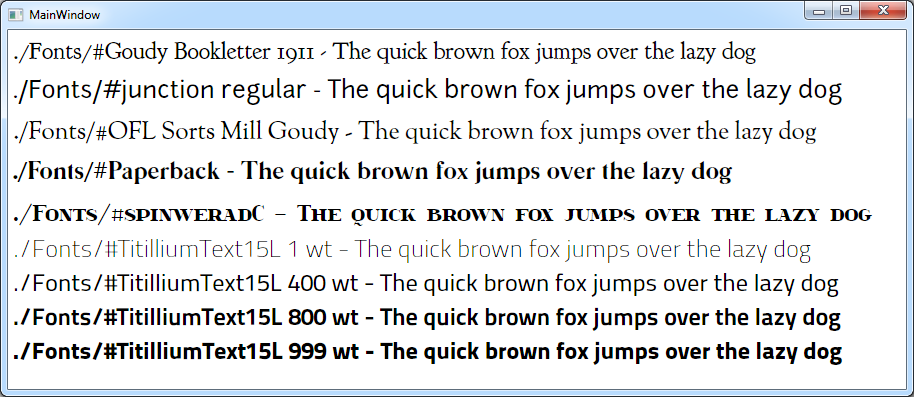
Here is a sample application that uses some of my favourite of OFL-licensed fonts from around the web including Titillium, Goudy Bookletter 1911, and Junction. Great resources for finding new fonts with the OFL license is the Open Font Library and the League of Movable Type.

download source [413 KB] (including fonts!)

From a programming point-of-view it pays to remember this trick from the MSDN for finding the names of embedded fonts. Sometimes the name is not apparent from the file name OR from the info you see in the "Install Font" dialog in windows. Instead you can programatically iterate through the installed fonts using this snippet of code.

// iterates over embedded fonts - assumes you have fonts in a sub-directory called "Fonts" in the project in visual studio
foreach (var fontFamily in Fonts.GetFontFamilies(new Uri("pack://application:,,,/"), "./Fonts/"))
{
    // do stuff with fonts here
}

»

Author image

.NET Framework 4.0 Solves the Single Biggest Problem with WPF Development

.NET Framework 4.0 solves the single biggest problem with WPF development - The size of the .NET framework redistributable. The full redistributable for the x86 version of the .NET framework weighs in at a svelte 37.71 MB, and the cut-down client profile (that should be suitable for many WPF client applications) is just under 31 MB! For 64-bit platforms (x64 and ia64) the full redistributable are about 55 MB each. They both have the x86 bits included also so x86 .NET applications can run in the WoW. »

Author image

The Visual Guide to WPF Font Weights

Have you ever wondered what the difference between DemiBold and SemiBold text is? (the answer: not a whole lot). Have you ever wanted to go beyond "Normal" and "Bold" in your font weight selections? If so then this post is for you. The following shows the different font weights (both names and numeric values) for the default UI font in Windows 7 and Windows Vista - Segoe UI at 24pt. We can immediately see that Segoe UI supports a variety of weights, but why does 'Thin' (supposedly at 100-weight) look the same as 'Light' (300-weight)? »

Author image