Bing Maps control for WPF (Beta)

WPF-focused goodies from Microsoft have been a bit thin on the ground lately, but today the Bing team released a beta version of a WPF control they’ve been developing for including Bing maps in your WPF application. One of the main focuses for the control is support for Microsoft Surface and multi-touch. You can find more details about the control on the Bing Maps Blog. There are already a number of community samples and libraries, including the InfoStrat.VE control, but it’s nice to see something produced by MS.

»

Author image

Resharper-style Error Template for WPF

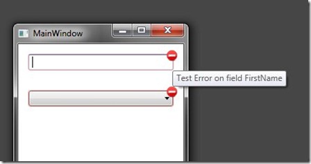
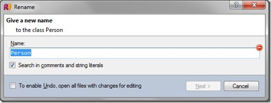
The built-in error template in WPF is quite basic: a red rectangle around the control that is in error, and I invariably replace it with something a little fancier. I’m not sure who originated this style of error/validation template, but I know it best from the Visual Studio add-in Resharper.

resharper_style_error

Using an error icon such as this one from openclipart.org and a fairly simple error template we can create a similar effect of our own that works for multiple control types, and comes complete with a data-bound tool-tip to display the appropriate error message.

error_template Like all my recent WPF samples the source-code for this is included in the learnwpf samples project hosted on bitbucket.

»

Author image

Changing the DataTemplate based on the Available Space – SizeBasedTemplateSelector

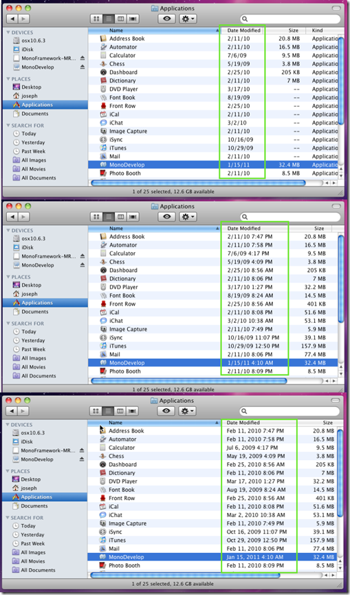
DataTemplates are a pretty useful feature in WPF, but wouldn’t it be great if you could change the data template based on the size available to display the data? Several media players (including the Zune player) present a kind of ‘postage-stamp-sized’ UI when shrunk below a certain size. Date columns in the Finder in OSX are another example of UI that adjusts to the available space – as the width of the column increases the format of the date changes to show more information. I wanted to bring this kind of capability to WPF.

resize

Fortunately WPF has the built-in support for programmable template selectors, in the form of the (aptly named) DataTemplateSelector, so I created the SizeBasedTemplateSelector. You set it up with one or more templates, and specify what the minimum and maximum sized for those templates should be. Then as the content is re-sized it changes the data template as required. Templates and their relative sizes are all done declaratively like so:

<l:SizeBasedTemplateSelector x:Key="sizeBasedSelector">
    <l:SizeBasedTemplateSelector.TemplateSizes>
        <l:TemplateSize MaximumSize="120, 20">
            <l:TemplateSize.DataTemplate>
                <DataTemplate>
                <TextBlock Text="{Binding StringFormat=dd-MM-yy}" FontSize="18" />
                </DataTemplate>
            </l:TemplateSize.DataTemplate>
        </l:TemplateSize>
        <l:TemplateSize MinimumSize="120, 0" MaximumSize="220, 30">
            <l:TemplateSize.DataTemplate>
                <DataTemplate>
                <TextBlock Text="{Binding StringFormat=dd-MMM-yyyy}" FontSize="19" />
                </DataTemplate>
            </l:TemplateSize.DataTemplate>
        </l:TemplateSize> …

Like all my recent samples it is online at bitbucket as part of the learnwpf.com samples project

Here is a short video of the sample app in action (heavily inspired by the OSX finder)

»

Author image

Thankyou Mr. Russinovich - Process Explorer 15 adds GPU monitoring

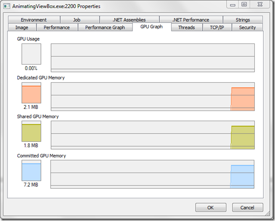
A recent update to the widely used Process Explorer tool from sysinternals adds GPU monitoring for individual processes. Although not as detailed as the information from the WPF Performance Suite the ubiquity of Process Explorer and xcopy deployment make it useful for troubleshooting GPU issues away from the development environment. As more UI frameworks leverage the power of the GPU like WPF does this kind of information will become more necessary when investigating application performance.

process_explorer_GPU

»

Author image

Adding a system-wide keyboard hook to your WPF Application

A global keyboard hook is, as the name suggests, a means for your application to intercept (or ‘hook’) all keyboard events, not just those that occur when your application has focus. Recently I needed just such a keyboard hook for a WPF application, and wanted to be able to set focus back to my application when a particular keyboard combination was pressed. Using the C# keyboard hooking code of Stephen Toub as a starting point I created the desired system keyboard hook for WPF.

hook

I’ve added the code to my learnwpf.com samples project on bitbucket. The key moving parts are:

keyboardhook.cs – This contains the Win32 API calls for hooking keyboard input, as well as a static method for bringing focus back to a window of your choice when the keyboard hook is triggered (which is surprisingly hard in more modern versions of windows where some measures have been taken to stop apps stealing focus from others.) This code also uses the Keyboard.Modifiers to check to see if the CTRL key has been pressed. There were some posts on-line that suggested that this doesn’t work properly when your app doesn’t have focus (which would be a major problem for what we’re doing). Fortunately it seems that this problem has been solved in .NET 4.0.

EntryPoint.cs – Instead of the WPF application starting in the ‘normal’ way through app.xaml I had to create a separate entry-point. I did this to attempt to ensure the keyboard hook is disposed off when the application exits, but you might be happy with handling the exit event and disposing of the keyboard hook there. Here we also set what key combination we want to trigger the KeyCombinationPressed event (in this case it is CTRL+F1)

App.xaml.cs -  Handles the KeyCombinationPressed event raised by the keyboard hook, and uses KeyboardHook.ActivateWindow() to bring the focus back to the main window. Note that this code needs to be run on the UI thread for the application (hence the Dispatcher.Invoke).

I haven’t had much of a chance to test this on older versions of windows, so please let me know if you encounter any problems.

[Image courtesy of lovestruck]

»

Author image

Animating ViewBox for WPF

ViewBox (or more accurately Viewbox for those pedants playing along at home) is a nifty little convenience wrapper around scale transformations that is typically used to scale up content to fit a given area. Recently I wanted a Viewbox that animated on resize, and thus the AnimatingViewBox was born.

Essentially it allows you to specify an easing function for the resize, and a duration for the X and Y.

<Samples:AnimatingViewBox Grid.Row="1" Margin="20" 
         ResizeXDuration="0:0:0.5" ResizeYDuration="0:0:1">
    <Samples:AnimatingViewBox.EasingFunction>
        <BounceEase Bounces="1" Bounciness="0.6" />
    </Samples:AnimatingViewBox.EasingFunction>
    <TextBox Text="Test" AcceptsReturn="True" BorderThickness="0" />
</Samples:AnimatingViewBox>

Or you can just use it as a drop-in replacement for the Viewbox, in which case it defaults to about 300ms for the X and Y resize, and a BackEase.

The source code and sample application are available on bitbucket as part of my learnwpf samples project.

Here is the obligatory video

»

Author image

WPF Kaleidoscope Inspired by Coco and Igor Movie Credits

I recently watching the movie Coco and Igor (which chronicles the brief romantic encounter between Coco Chanel and Igor Stranvinsky), and was impressed by the beautiful opening credits which really set the tone for what was a very stylish film. After that I was naturally tempted to try and re-create the effect in WPF. You can see the results here (with supporting soundtrack courtesy of Igor Stravinsky).

Damask kaleidoscope inspired by Coco & Igor opening credits from Joseph Cooney on Vimeo.

For comparison a portion of the original credits are at the end of the video (from about the 45~second mark onwards). I didn’t refer to the original credits at all when I was creating my ‘version’ which is probably all to the good – I probably would have found it too depressing, because the original credits are still much better. The code is included as a project in my LearnWPF samples project on bitbucket.

»

Author image

Shorter Samples now Available on BitBucket

I’m trying to gather together some of the smaller samples I’ve published here on learnwpf.com into a single solution on bitbucket. You can fork/download from here. There’s not much there at the moment, but I’ll try and gather up all the samples I’ve ever written that I think anyone could find remotely useful and include them. Larger things (like thematic) will still exist separately.

»

Author image

Come on, Feel the Noize–adding noise to your WPF applications

Humans live in an analogue world, where even the most uniform-looking things display some variation in color. Subtle gradients are one type of color variation typically seen on ‘real-world’ objects, and are well understood in software UIs (to the point of abuse). Real-world objects also often exhibit variations in color caused by the texture (sometimes these are quite striking). When we see an image like the one below we immediately know how this particular object would feel to touch, how soft it would be and maybe even how it would smell.

leather_texture

In contrast with all this things in the digital world are often much flatter and less visually interesting, without any of the suggestion of texture and the associations they bring. Complex textures (like leather) are usually best achieved with photos of real-world objects, but increasingly subtle use of digital noise is being used to create a little bit of visual variation to otherwise flat UIs.


dribbble_crop

demo

build-killbots

So how can I use this in my WPF application?

The simplest way to add noise to your WPF applications has been to create a ‘noisy’ texture using an imaging program like Photoshop, the GIMP or Paint.NET, and use it as an image source to an ImageBrush in WPF. If you’re working with a visual designer this is probably what they’ll do. One pretty common trick here is to make the noise image almost completely transparent – it can then be layered over the top of gradients and the like to create more complicated visual effects which would otherwise need to be created as a single large bitmap. This technique can be seen in ‘SimpleNoise’ sample application in the download. An ImageBrush is defined like so, using a ‘noise’ PNG image that has been created with the GIMP added as a Resource to the project as the ImageSource:

<ImageBrush x:Key="noise" ImageSource="noise.png" TileMode="Tile" Viewport="0,0 128,128" ViewportUnits="Absolute" />

When overlaid on a dark gradient the following dark and slightly noisy background is created. In the sample shown a small amount of noise has also been added to background of the light block of text in the middle.

simple

Programmers do it in code

If you’re a developer your Photoshop muscles may be weak or non-existent. Also the ‘static’ approach has a number of drawbacks. Textures that look good over dark backgrounds will not work well with light ones, or textures created for one color may not suit another. Each texture you add increases the size of your application, and if your application needs to support a number of themes or dynamic color schemes it can become a bit of a pain to generate multiple ‘noise’ image. For these reasons I created a programmatic means of creating noisy textures in a WPF application, allowing the developer to specify the different colors to be used, and the frequency with which they should appear. This can be seen in the ‘ComeOnFeelTheNoize’ project in the download. Once again an ImageBrush is used over the top of an object with a dark gradient as the background. This time however the ImageSource for the brush is bound to another resource called NoiseGenerator:

<n:NoiseGenerator x:Key="background_noise" Size="128">
    <n:NoiseGenerator.Colors>
        <n:ColorFrequency Color="#33222222" Frequency="30" />
        <n:ColorFrequency Color="#3300A500" Frequency="1" />
        <n:ColorFrequency Color="#55E0E0E0" Frequency="15" />
        <n:ColorFrequency Color="#33666666" Frequency="15" />
    </n:NoiseGenerator.Colors>
</n:NoiseGenerator>
<ImageBrush ImageSource="{Binding Source={StaticResource background_noise}, Path=NoiseImage}" x:Key="noise" TileMode="Tile" ViewportUnits="Absolute" Viewport="0,0 128,128" />

Once again, when the noisy ImageBrush is overlaid on a dark gradient a very similar dark and slightly noisy background is created. The NoiseGenerator has also been used to create a noisy background for the light block of text in the middle.

generated

The NoiseGenerator uses a very simplistic algorithm to generate the noise image. One enhancement would be to implement alternate ‘noise’ algorithms which can suggest materials of a different ‘’texture’ to the eye.

Alternative Approaches

Aside from the super-simple approach of creating an ‘noise’ image file using an image editing tool there are a few other approaches to getting programmatic noise. One alternative approach would be to add noise via a pixel-shader.

So finally, everyone..this time with feeling! Come on, feel the noize.

Leather image courtesy of smig44_uk

»
Author image

WPF theme generation with Thematic–install via ClickOnce from CodePlex

My WPF theme creation tool thematic is now available for install directly from codeplex. I’m calling it beta 1 and it still has a few rough edges. Briefly here is the problem it tries to solve: The Problem: Creating a custom theme for your WPF application, such as selecting colors and creating custom control templates and styles can be a long and complicated process, especially for smaller teams without dedicated design skills. »

Author image